

A complete design restart
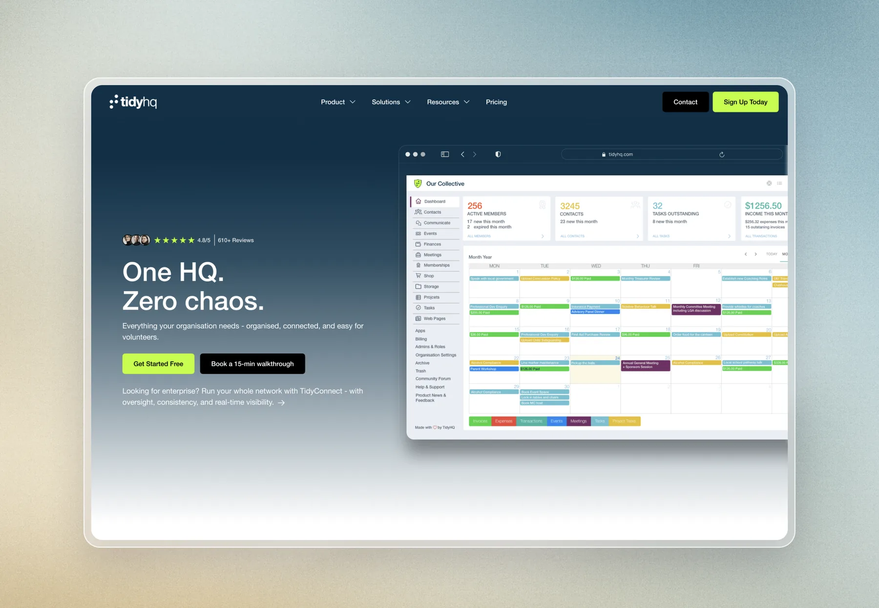
Rather than updating the old site, the redesign started fresh, so it clearly explains what TidyHQ does, who it is for and why clubs choose it.
The new design is built around how a busy volunteer administrator reads a page:
- A clear promise up top
- The product dashboard shown straight away, with a free sign up and walkthrough booking as the main actions.
- Trust early
- Star ratings and logos of organisations already using TidyHQ.
- Features grouped by outcome
- Memberships, events and communication, meetings and governance, and finances.
- Real people
- Video stories and testimonials from club presidents, secretaries and treasurers.
- Simple pricing
- Laid out so the free, Pro and enterprise options are easy to compare.
Copy shaped for SEO and AEO
Alongside the design came help shaping the copy, so TidyHQ could rank in search and appear in AI generated answers. The copy uses the words their audience actually searches for, such as membership management, club management software and event ticketing, while staying friendly and easy to read.
Each section answers a clear question a club administrator might ask, from how renewals are handled to how committees keep track of tasks. Writing this way gives search engines and AI tools direct, quotable answers, and helps visitors understand the product in seconds.
Animations that grab attention, without overdoing it
Section animations grip the audience as they scroll, bringing the product and its features to life.
They were kept deliberately restrained. Overloading a site with motion is very easy to do, and a lot of sites today fall into that trap, which ends up distracting from the message and slowing the page down. Every animation has a clear purpose, guiding the eye to the next key point rather than competing for attention.
Design built for a smooth developer handoff
Because TidyHQ's own developer was building the site, the design had to be clear and practical to build. The handover was a complete design with the copy in place and the animations clearly defined, so their developer could bring it to life accurately without guesswork.
The outcome
TidyHQ now has a fresh, modern website that explains a feature rich product simply, speaks directly to the volunteers who use it, and is written to be found in both search and AI answers.
It also shows that a design only engagement works. Whether Plyo handles the full build or the design alone, the goal is the same: a website that looks great, reads clearly and works hard for the business.
Start a project